Port of Melbourne
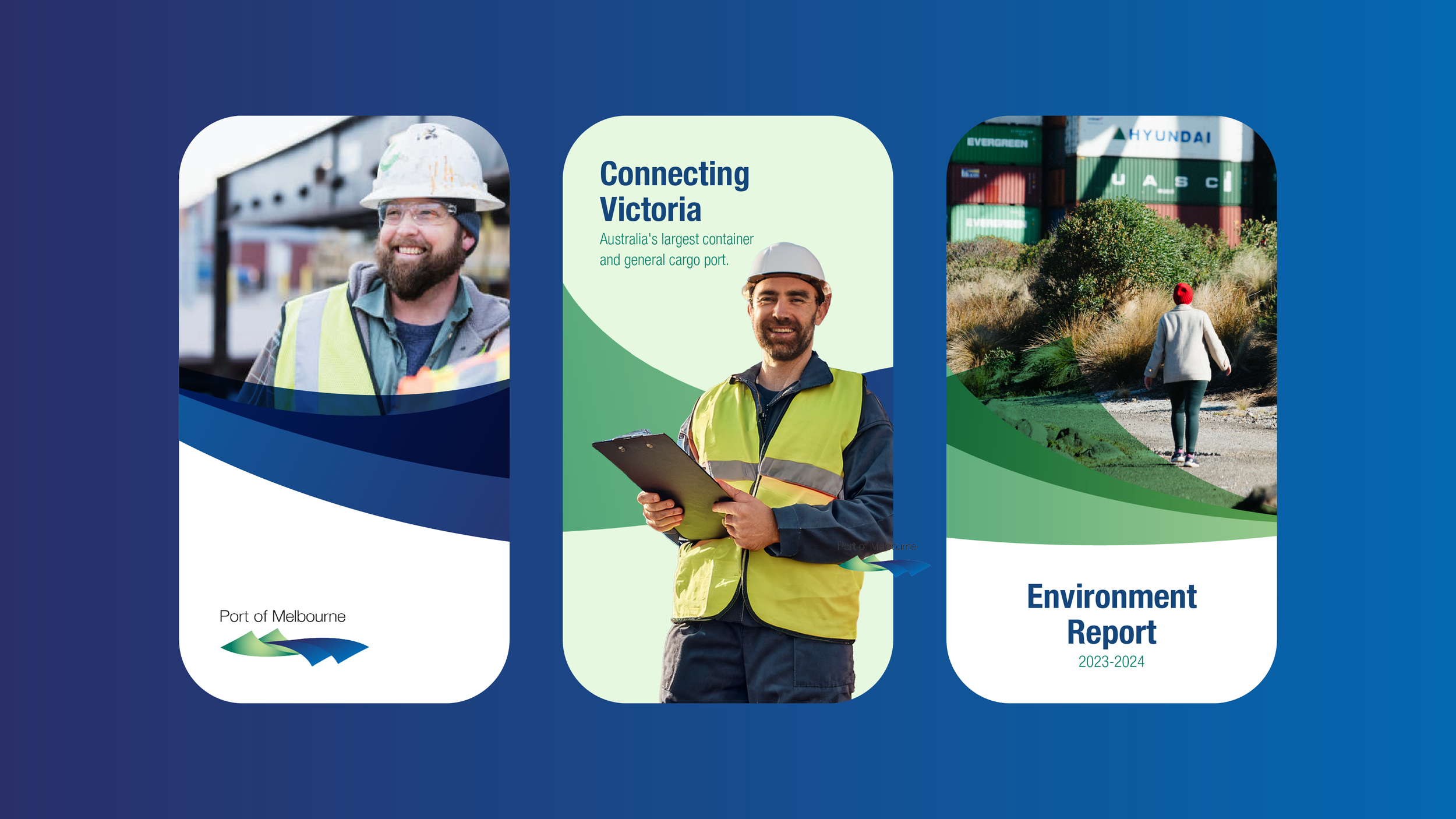
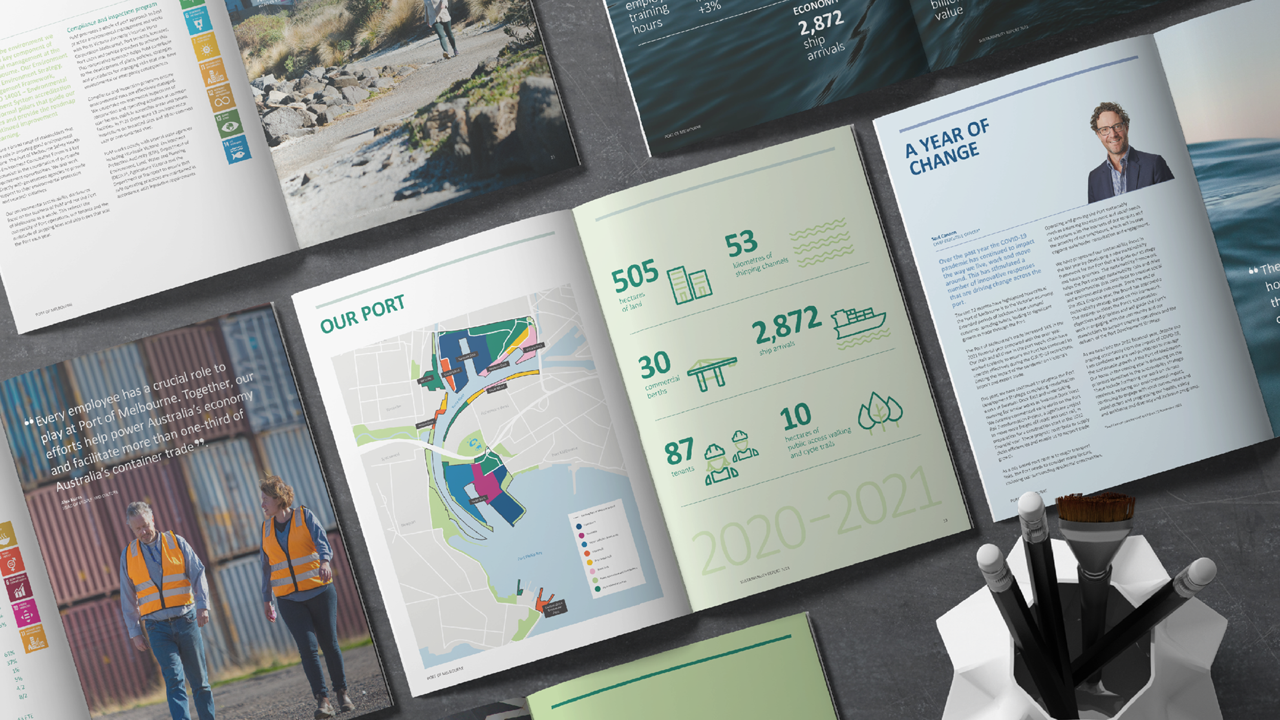
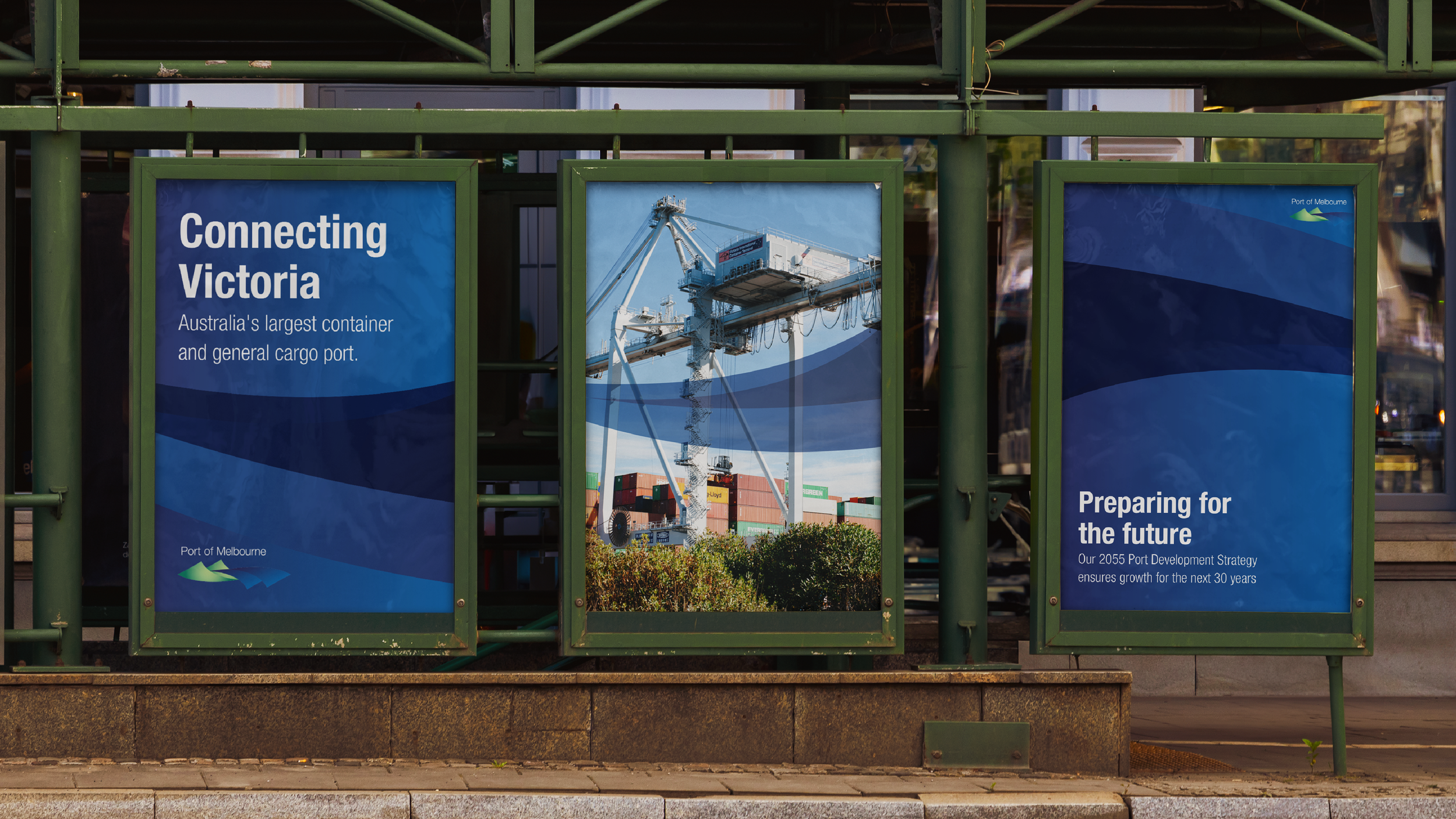
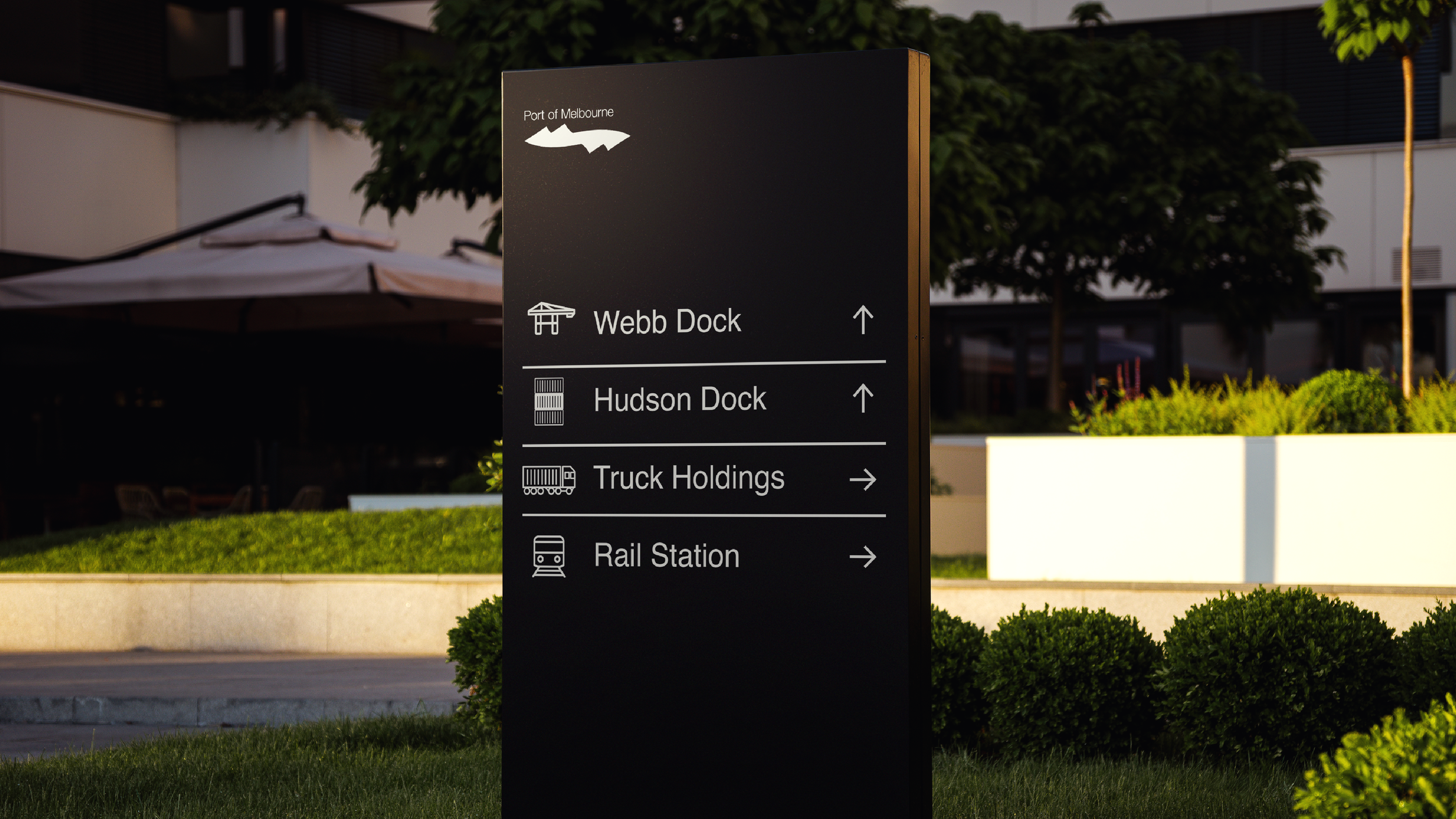
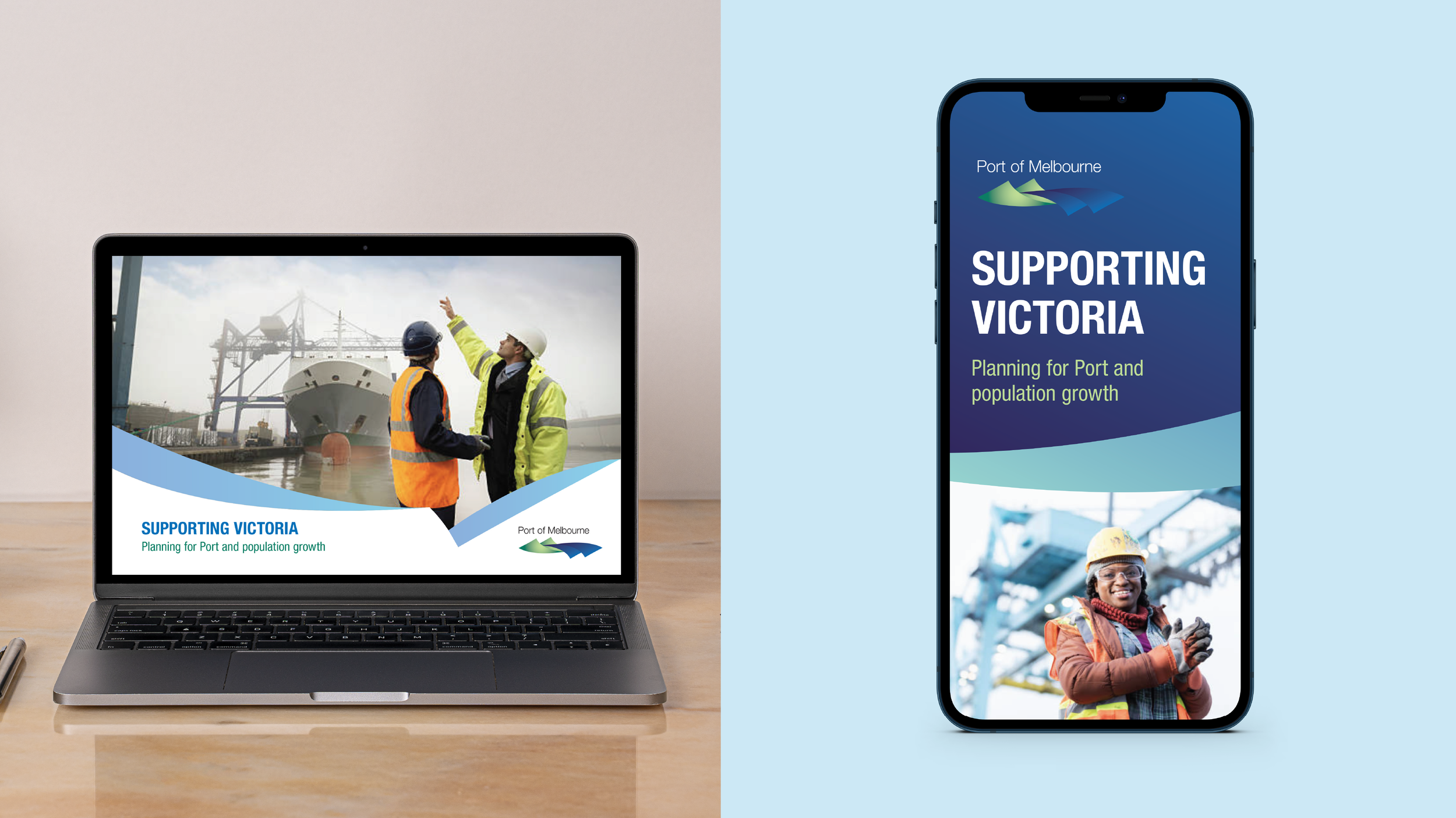
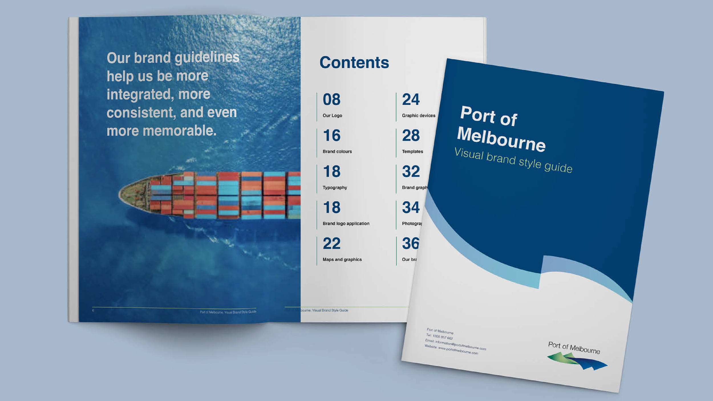
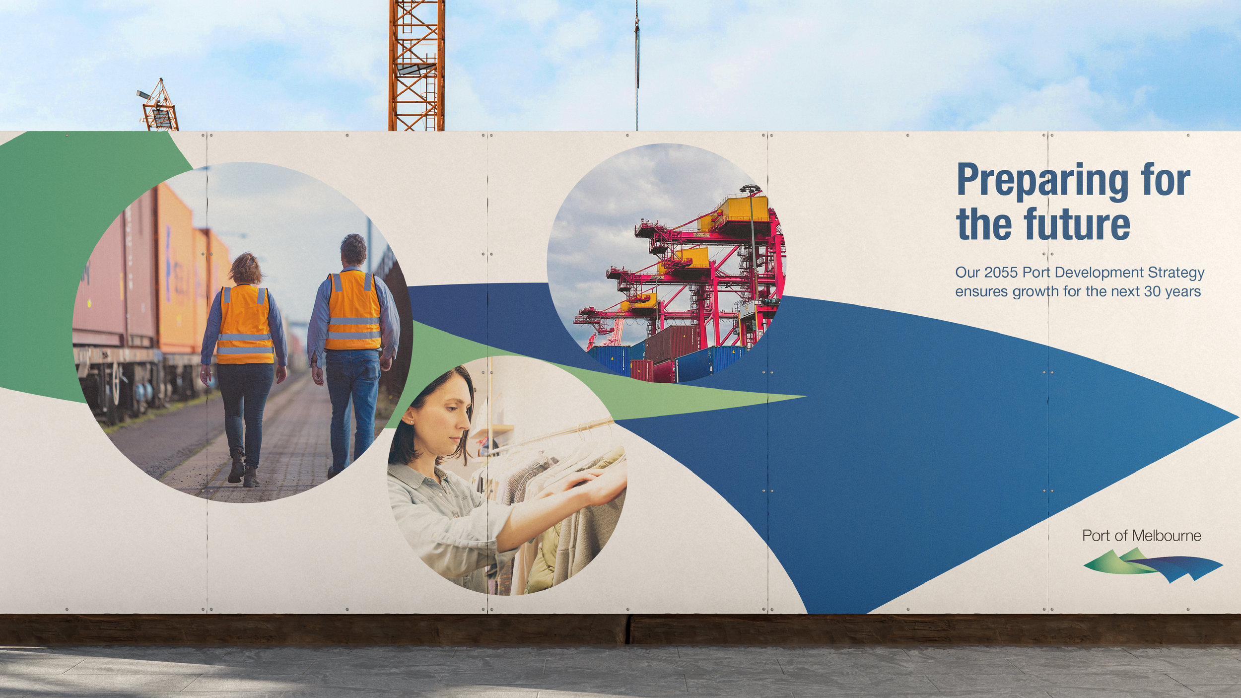
Port of Melbourne approached us for a brand refresh. The existing brand didn’t have a distinct visual framework to unify its communications, so we looked to the existing logo for a starting point. We used its dynamic wave shape as the foundation for a new visual ecosystem, extending it into iconography, colour coding, photography and graphic elements.
The aim was to create a system that felt uniquely Port of Melbourne while simplifying the way information was communicated across its many touchpoints. we were able to create a comprehensive visual direction from a relatively simple idea. The new system gave stakeholders a much stronger sense of cohesion across their communications, while the templates and icon set made it easier for their team to apply the brand consistently themselves. The iconography and visual system are still being used today, which is a great indication that the solution was both effective and practical.