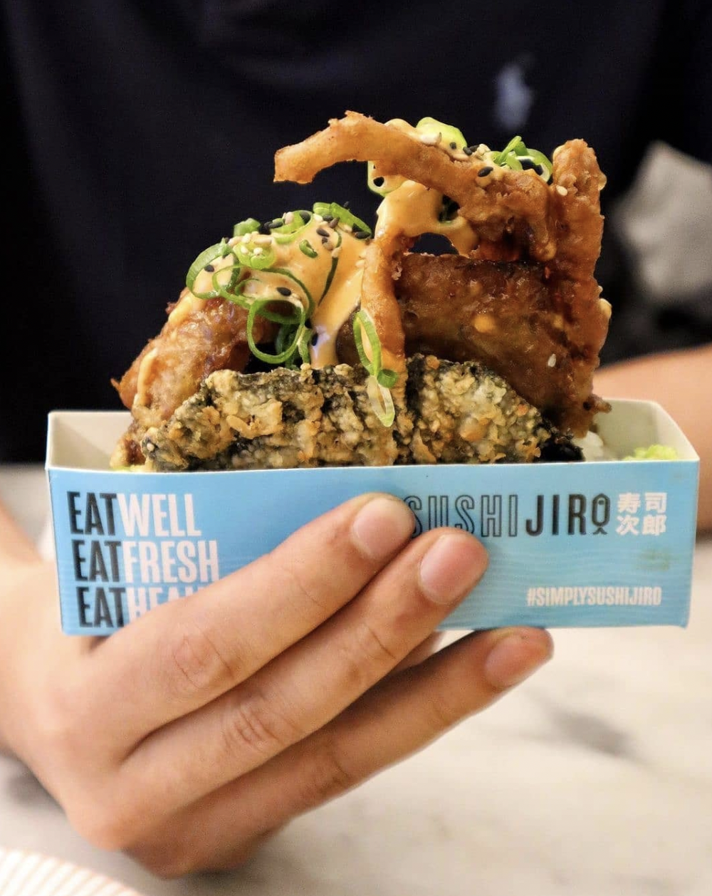
SUSHI JIRO
Sushi Jiro set out to become Melbourne’s premier destination for an accessible, memorable sushi train experience. The challenge was to create a distinctive brand that could stand apart in a crowded market while capturing the energy, colour and approachability of sushi train culture.
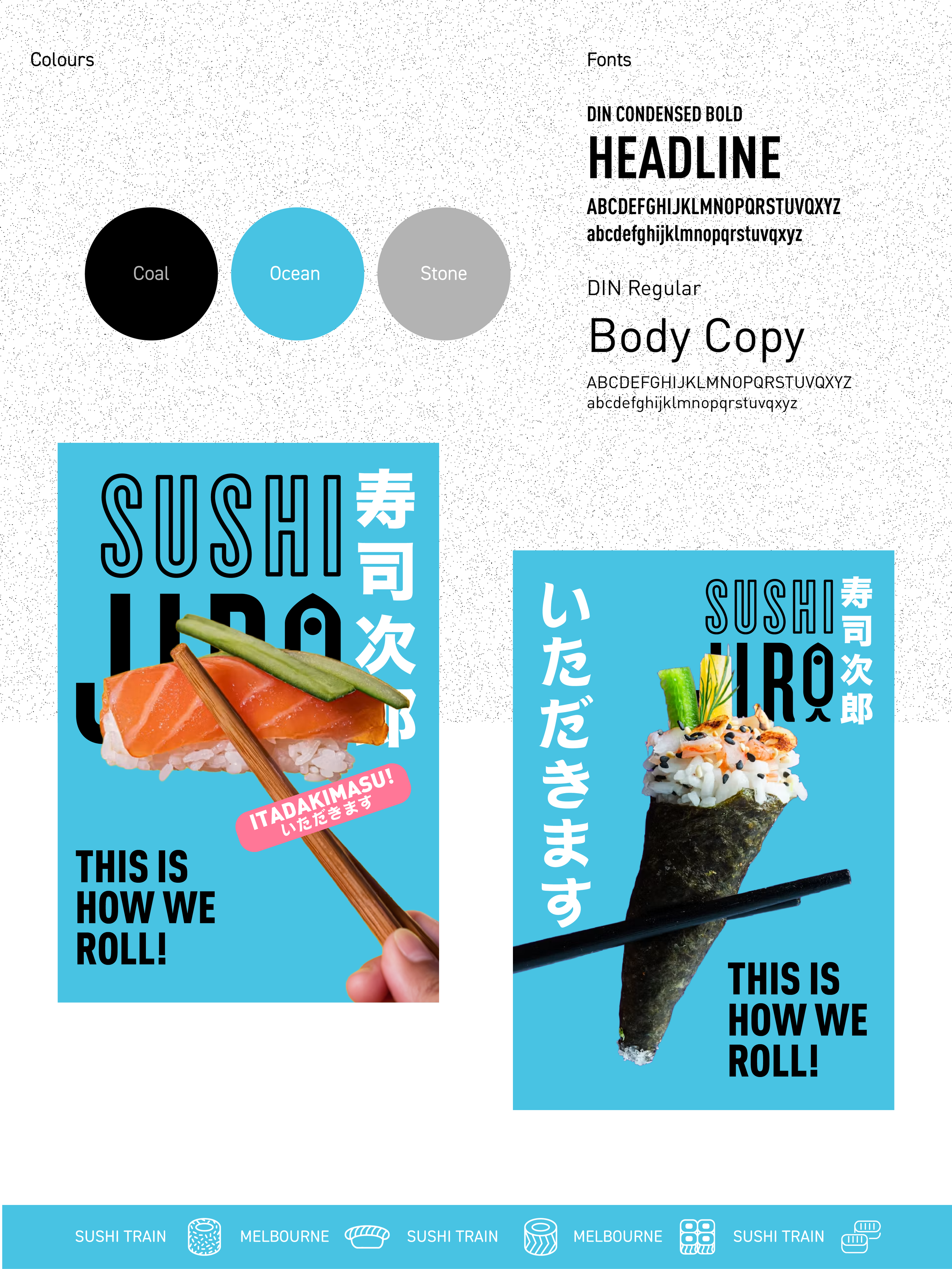
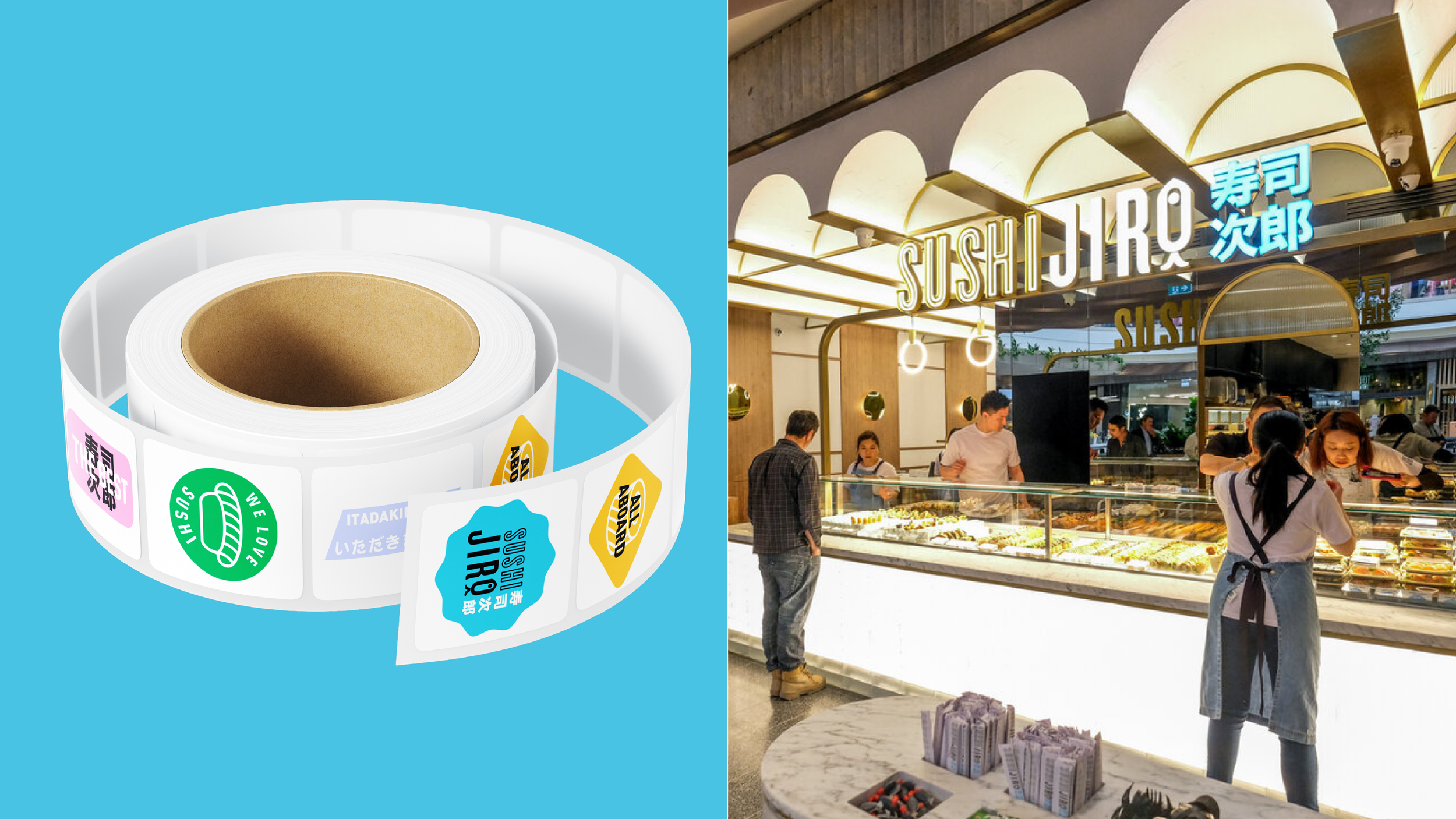
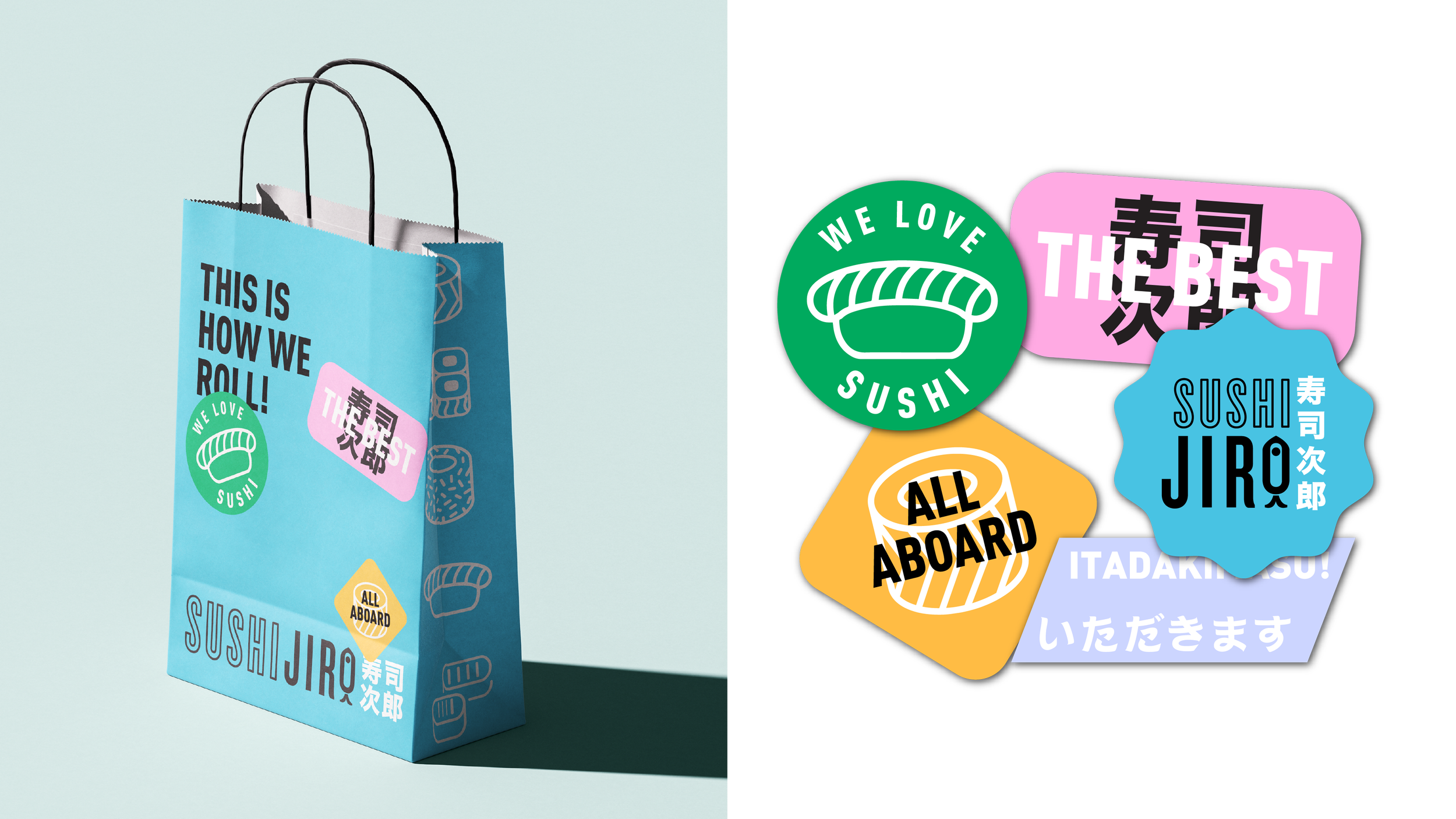
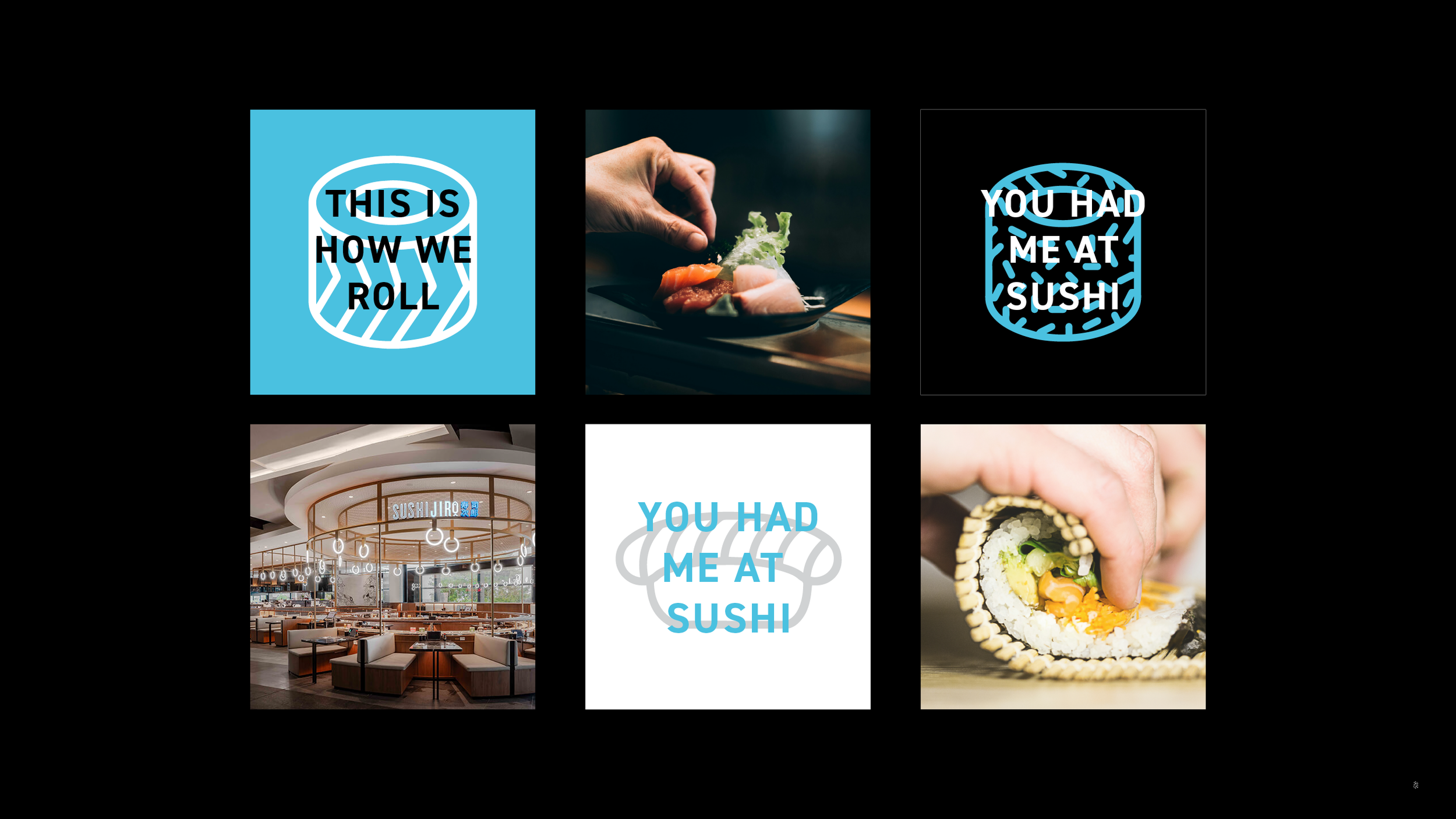
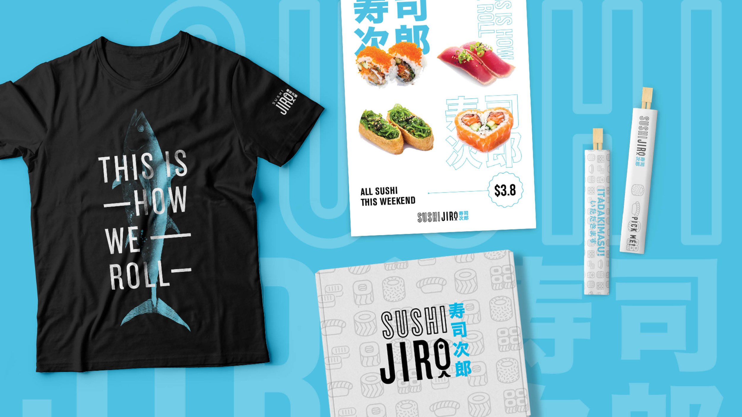
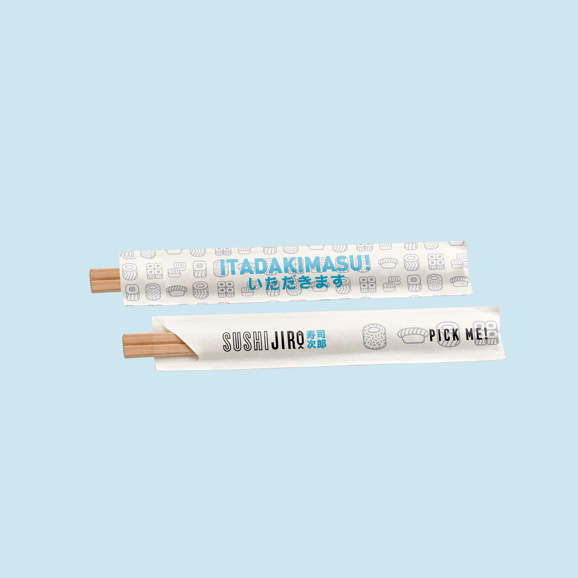
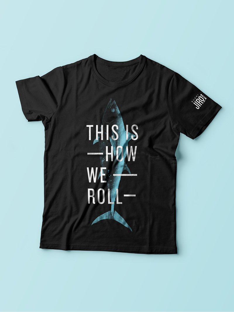
Inspired by the philosophy of keeping things simple and memorable, the brand identity combines bold typography, playful graphic elements and a vibrant colour palette to create a visual language that feels instantly recognisable. The custom brand mark and supporting graphics bring personality to the identity, while Japanese-inspired details are balanced with a contemporary, approachable aesthetic.
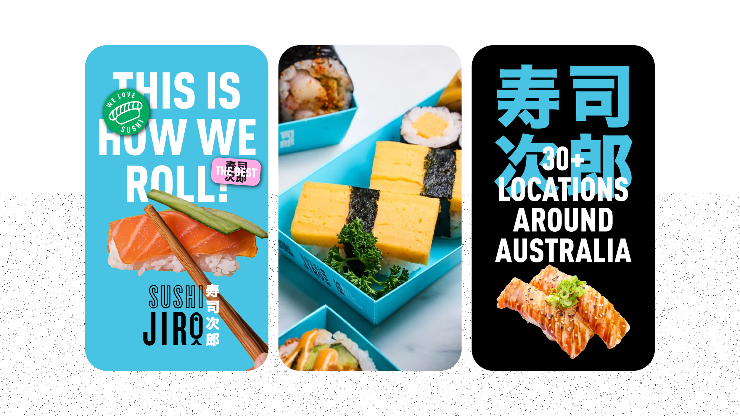
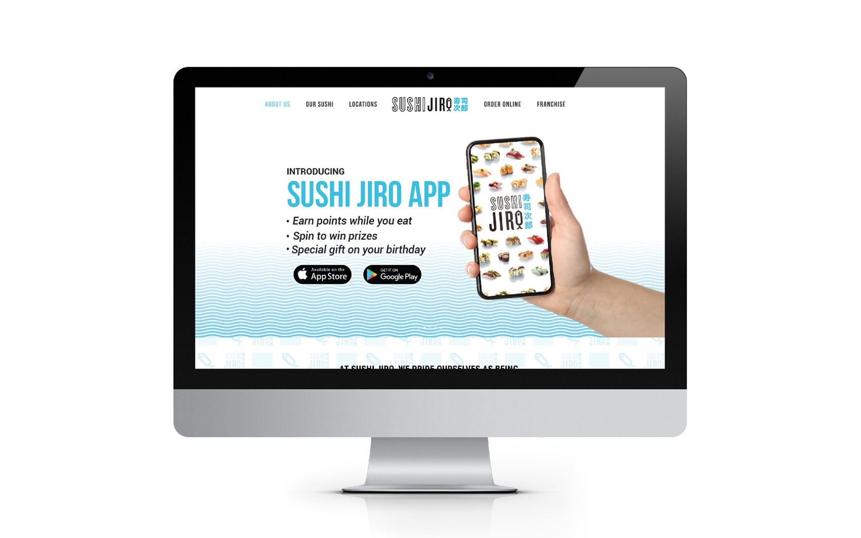
The result is a brand that feels energetic and familiar without relying on the traditional visual clichés of Japanese restaurants. Designed to work across everything from in-store environments and packaging to digital and social media, the identity has provided a flexible foundation for the brand’s growth.
Since its rebrand, Sushi Jiro has expanded to more than 30 locations across Australia, establishing itself as one of the country’s recognisable sushi train brands.

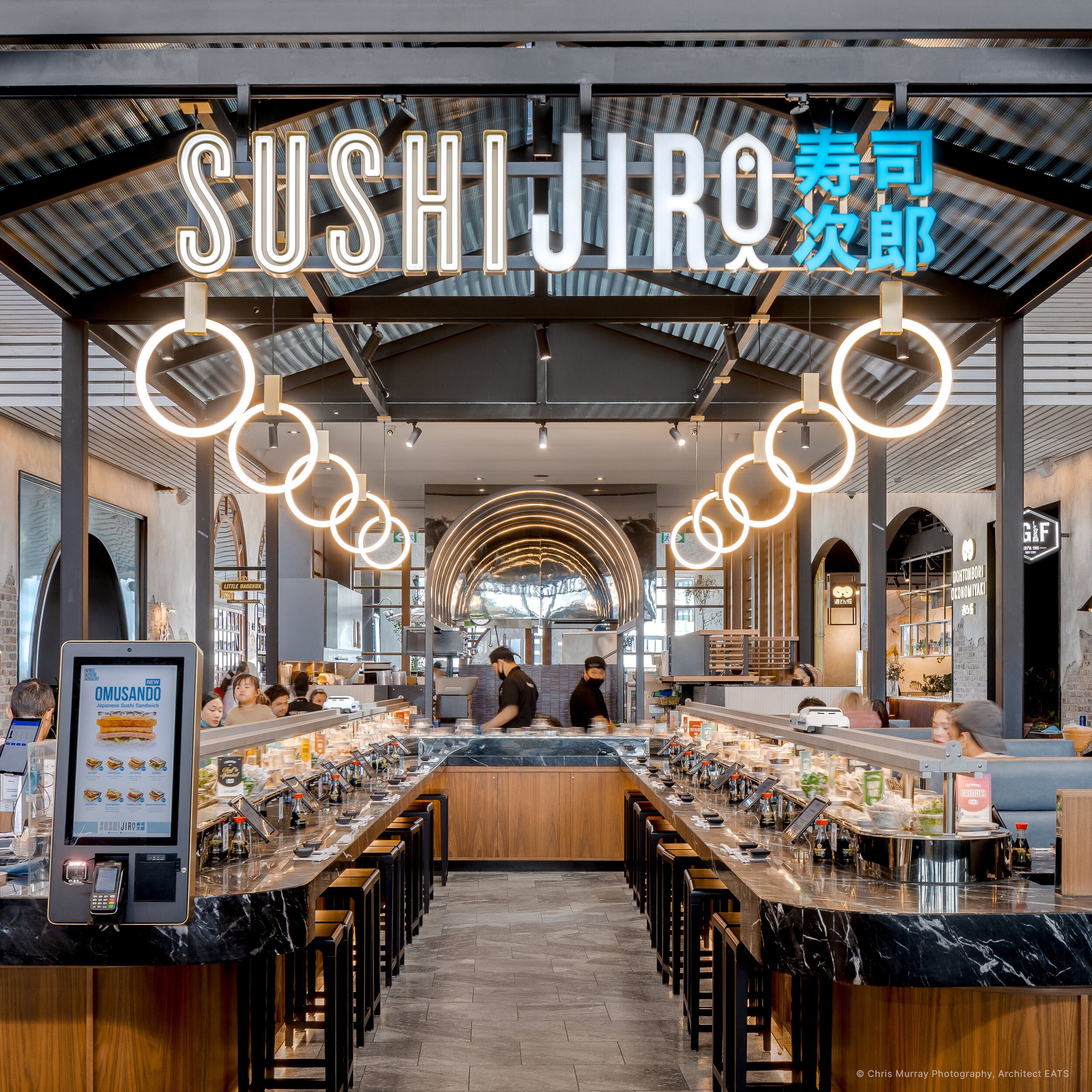

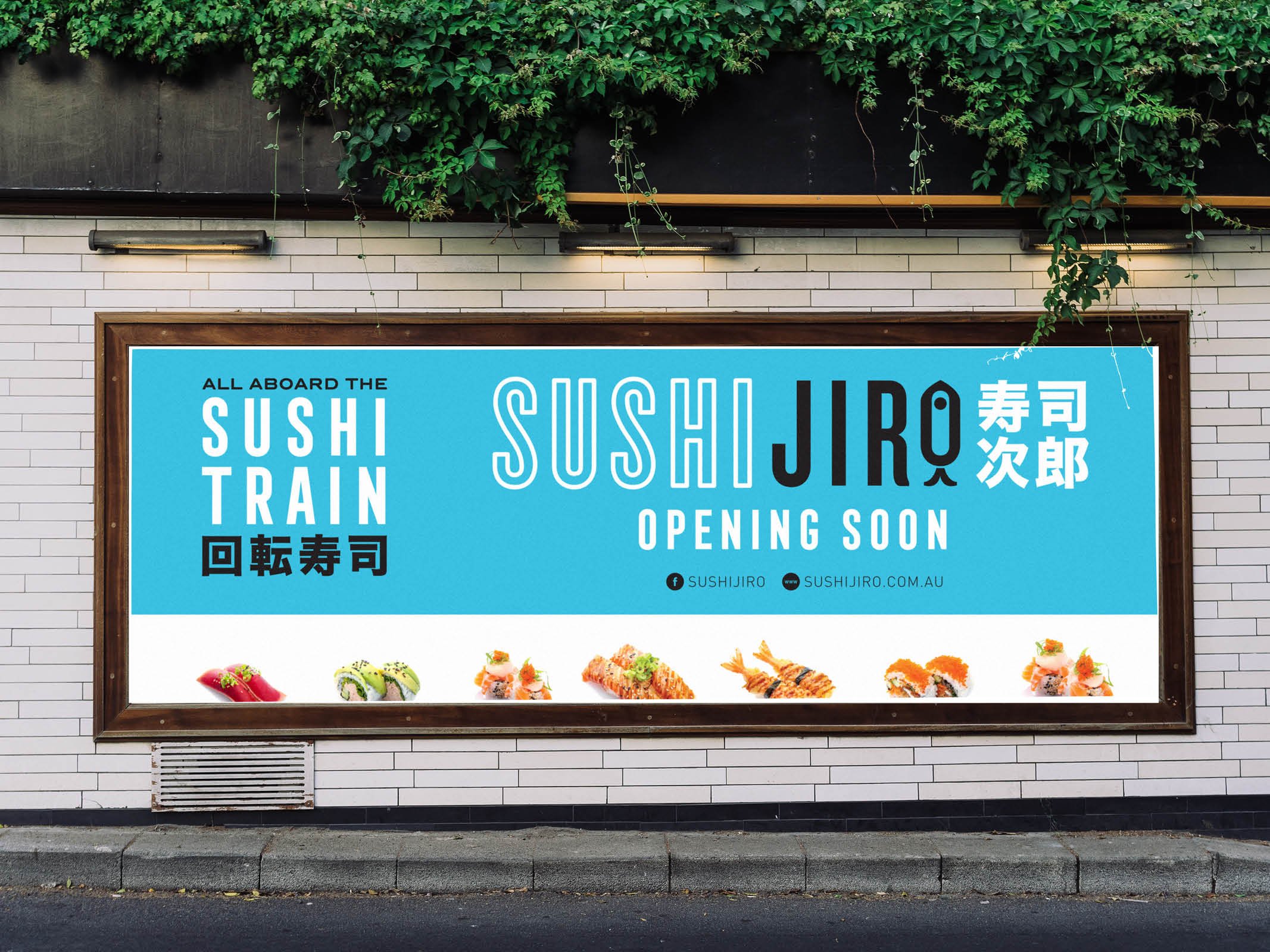
Sushi Jiro has expanded to 11 locations across Melbourne in prime shopping centres and CBD.