INNOXA
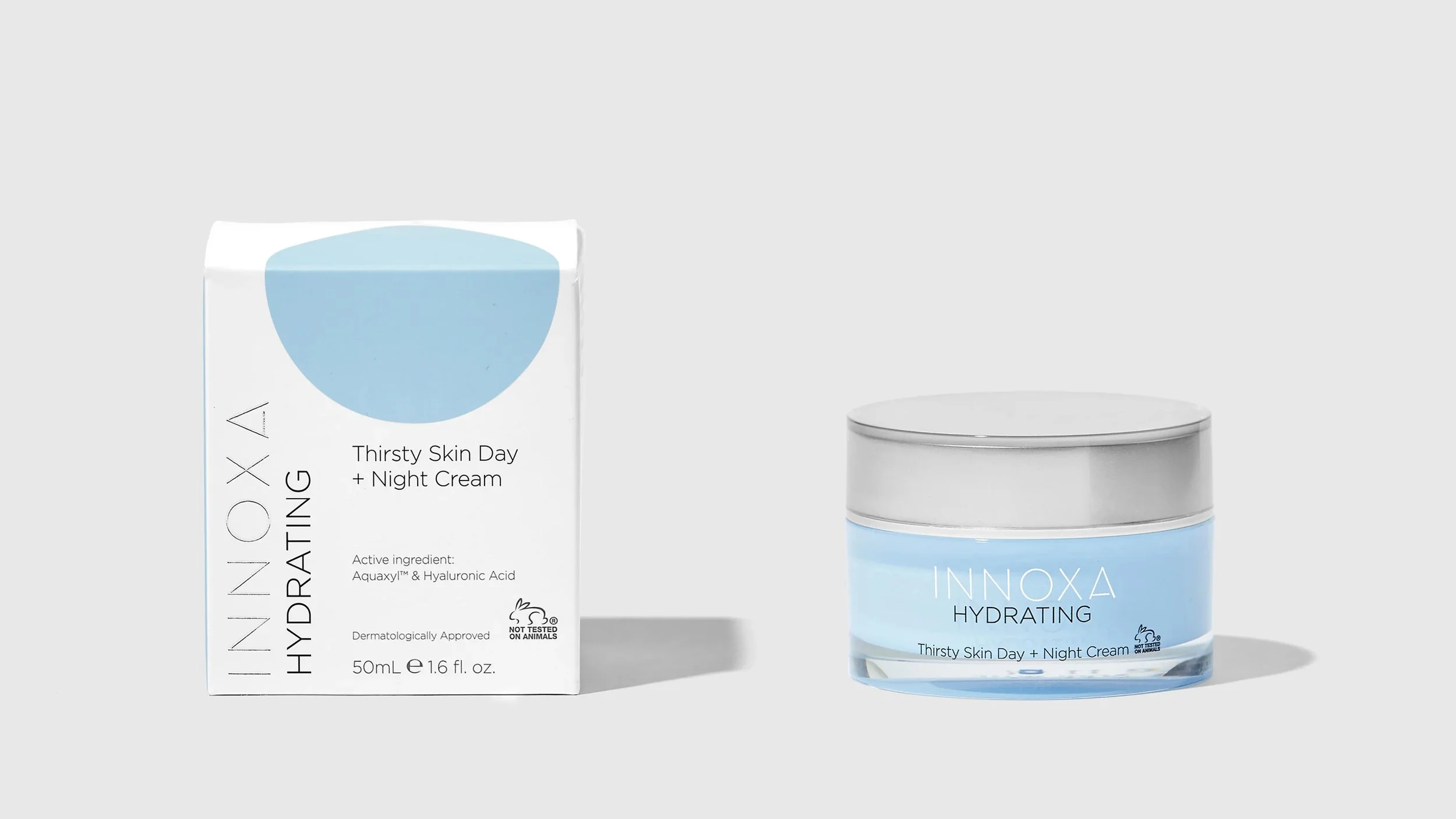
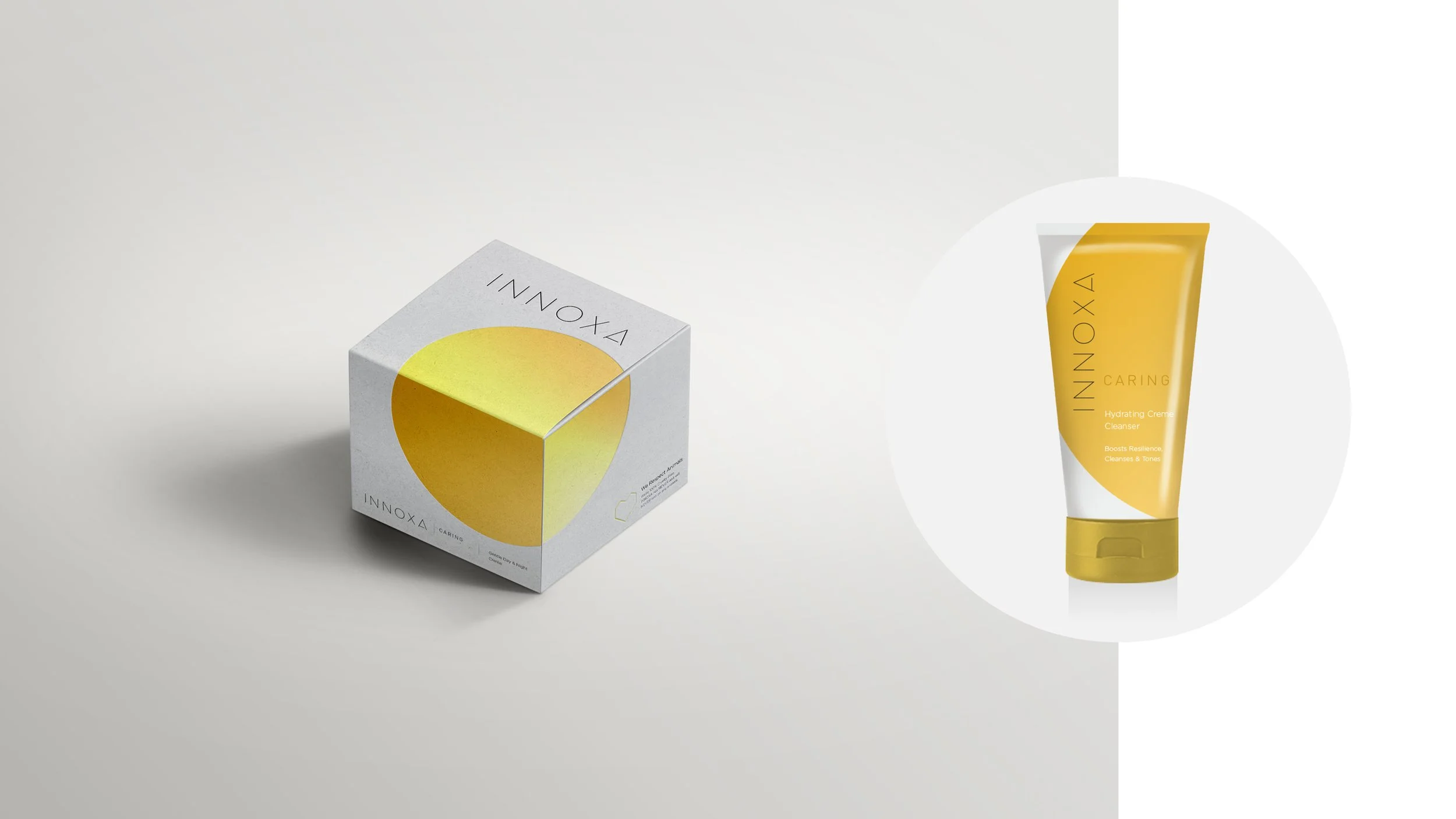
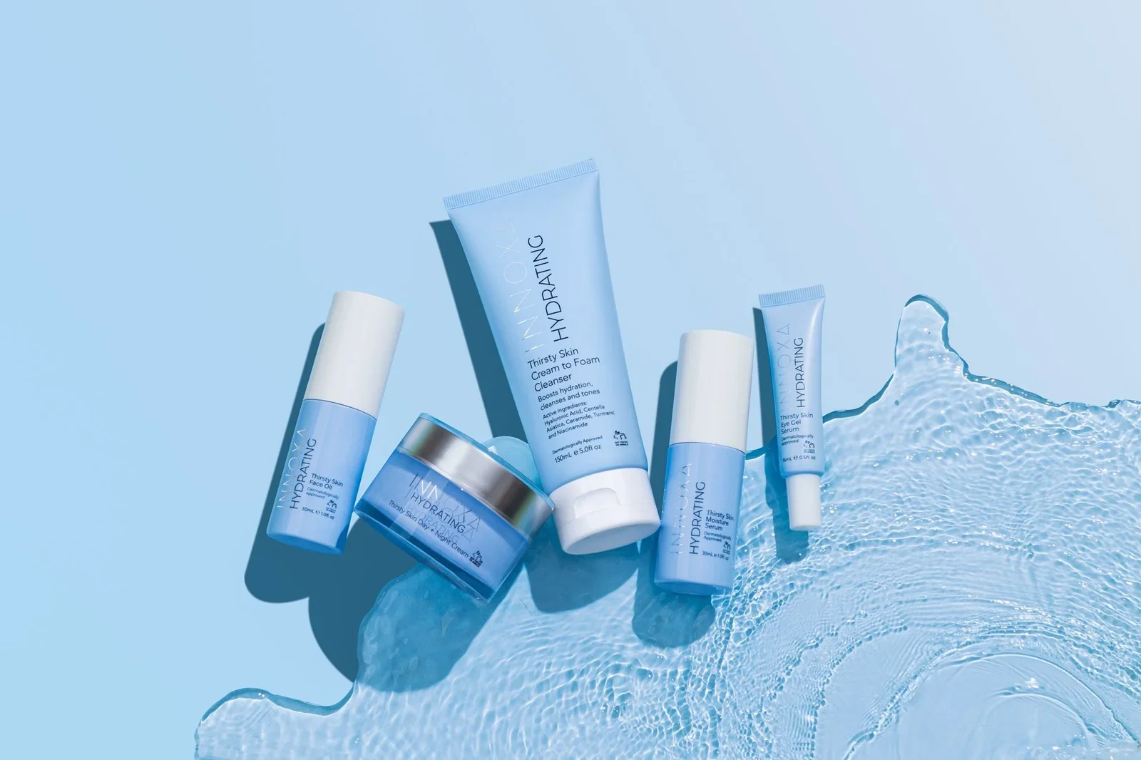
The design for Innoxa’s Hydrating range was guided by the brand’s long-standing commitment to sensitive skin, scientific credibility, and ethical beauty. As an Australian, cruelty-free cosmetic company, Innoxa sits at the intersection of dermatological trust and gentle, everyday skincare. The visual identity needed to reflect this balance—calm, considered, and quietly confident.
A minimal aesthetic was chosen to communicate clarity and transparency, allowing the product and its benefits to speak for themselves. Clean typography, generous white space, and a restrained colour palette create a sense of lightness and purity, reinforcing the idea of skin-friendly formulations that are free from unnecessary additives or exaggeration.
The circular motif plays a central role in the design. Inspired by molecular structures and scientific diagrams, it subtly references Innoxa’s dermatological roots and ingredient-led approach. At the same time, the circle symbolises wholeness, balance, and inclusivity—reflecting skincare designed for all skin types, particularly those that are sensitive or reactive.
Branding + Art Direction
Print Design
Packaging Design